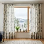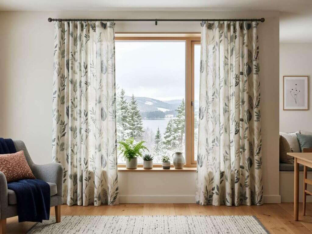
Printed drapery can add personality, softness, and visual interest to a room, but the key is balance. The right fabric, pattern scale, hanging height, and decor coordination can make printed curtains feel elegant instead of busy. Whether you prefer bold prints or subtle patterns, thoughtful styling helps your windows become a polished design feature without taking over the entire space.
Why Printed Drapery Needs Careful Styling
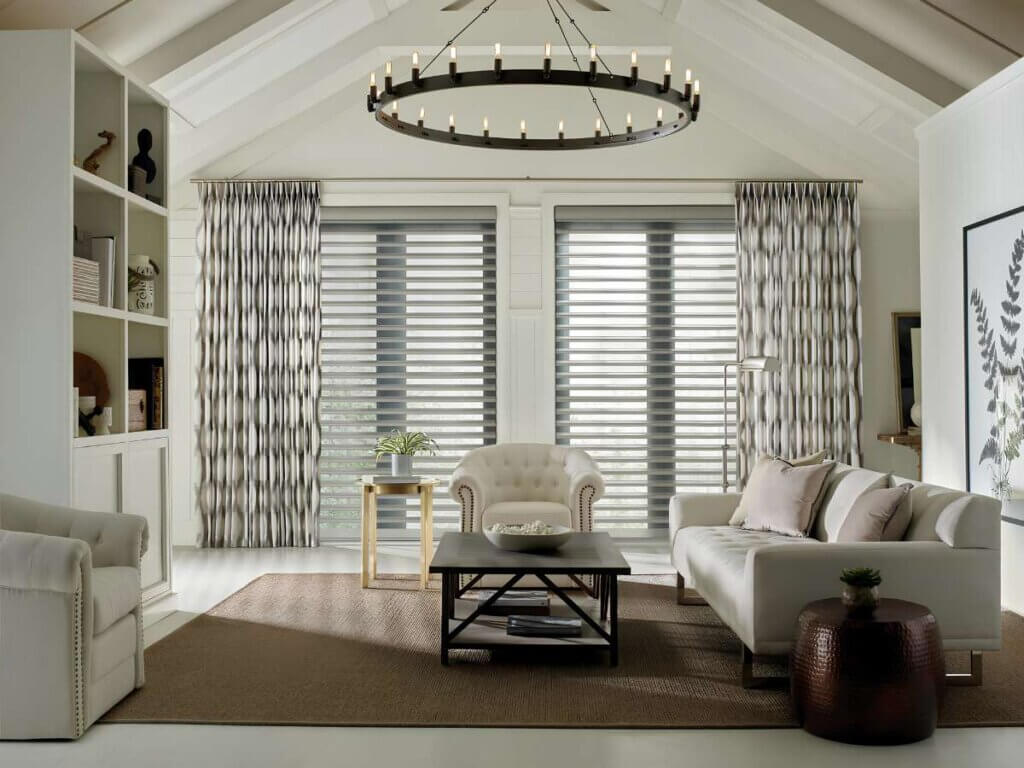
Printed drapery naturally draws the eye. That can be a good thing when the room feels plain, flat, or unfinished. However, too many competing patterns, heavy textiles, or bold accents can make the interior feel crowded.
The goal is not to avoid prints. It is to use them with intention. Drapes should support the room’s layout, lighting, and overall design while helping with privacy, softness, and comfort.
Choose the Right Pattern Scale
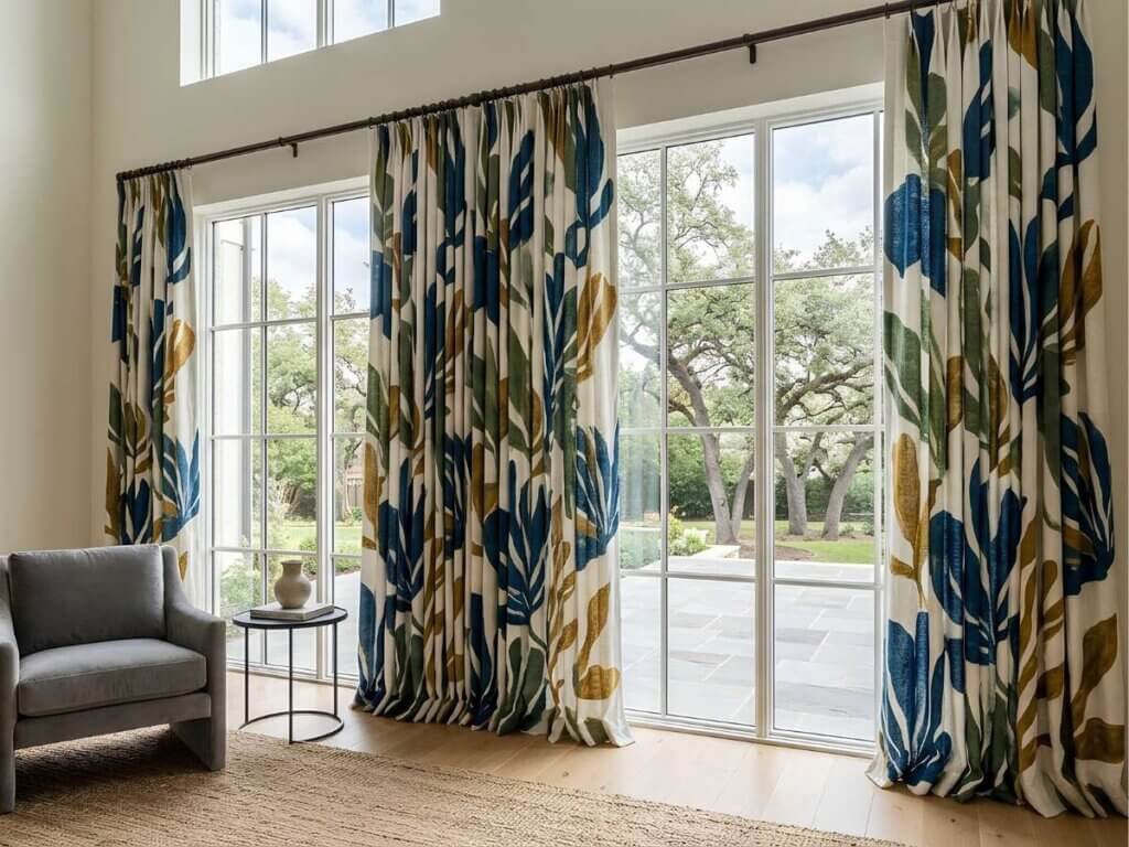
Match the Print to the Room Size
Scale matters when selecting printed drapery. Large patterns often work well in spacious rooms with tall windows, high ceilings, or minimal furniture. Smaller prints are better for compact rooms where a bold design may feel too strong.
Use this guide:
Room Type | Best Print Choice | Why It Works |
Small bedroom | Subtle or small-scale prints | Keeps the room calm |
Large living room | Medium to large patterns | Adds visual interest |
Formal dining room | Elegant, structured prints | Creates a refined look |
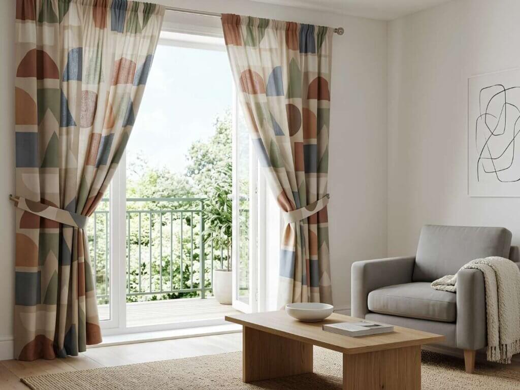
Modern space | Geometric or minimal prints | Feels clean and intentional |
Keep the Rest of the Decor Balanced
Printed curtains work best when the surrounding decor gives them room to breathe. If your drapery has strong patterns, choose simpler accents nearby. Neutrals, solid upholstery, and minimal wall decor help create balance.
A few smart styling tips include:
- Pair bold prints with neutral walls
- Use solid pillows or rugs when the drapes are patterned
- Repeat one color from the fabric in small accents
- Avoid using too many competing textiles in one room
- Keep furniture lines clean for a more modern look
This approach helps blend the drapery into the room, so it feels connected rather than separate.
Use Color Coordination, Not Exact Matching
Pull One or Two Colors from the Fabric
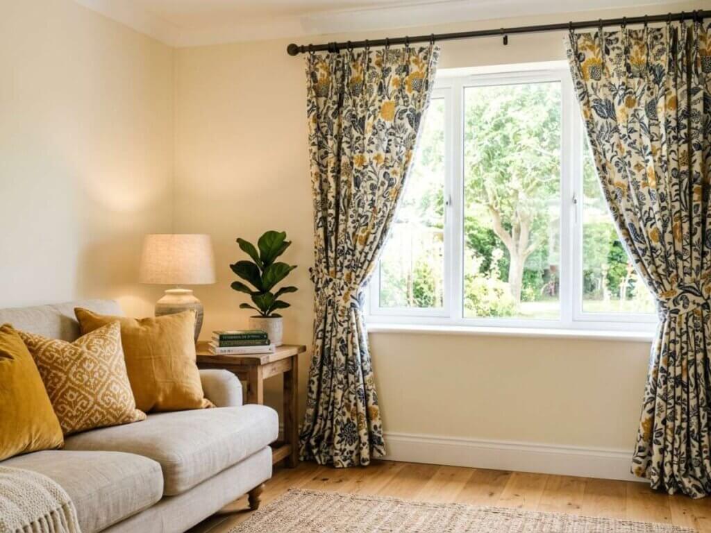
Your printed drapery does not need to match every item in the room. In fact, exact matching can sometimes feel too staged. Instead, look at the fabric and choose one or two colors to repeat throughout the space.
For example, if the panels include soft blue, warm beige, and cream, you can use beige upholstery, cream walls, and blue accents. This creates a sense of coordination without making the room feel overly themed.
Balance Pattern with Texture
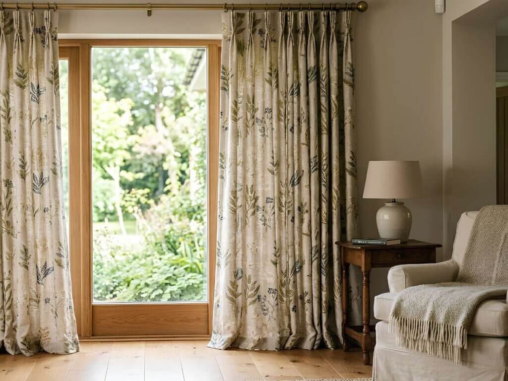
Texture is one of the easiest ways to elevate printed drapes. A patterned fabric with a linen-like texture, soft weave, or subtle dimension can add depth without looking loud.
If your printed drapery is colorful, choose quiet textures elsewhere, such as:
- Woven baskets
- Smooth wood finishes
- Solid rugs
- Matte metal hardware
- Simple bedding or upholstery
This contrast keeps the space interesting while maintaining a calm interior design.
Hang Drapery Panels the Right Way
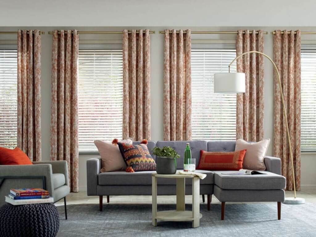
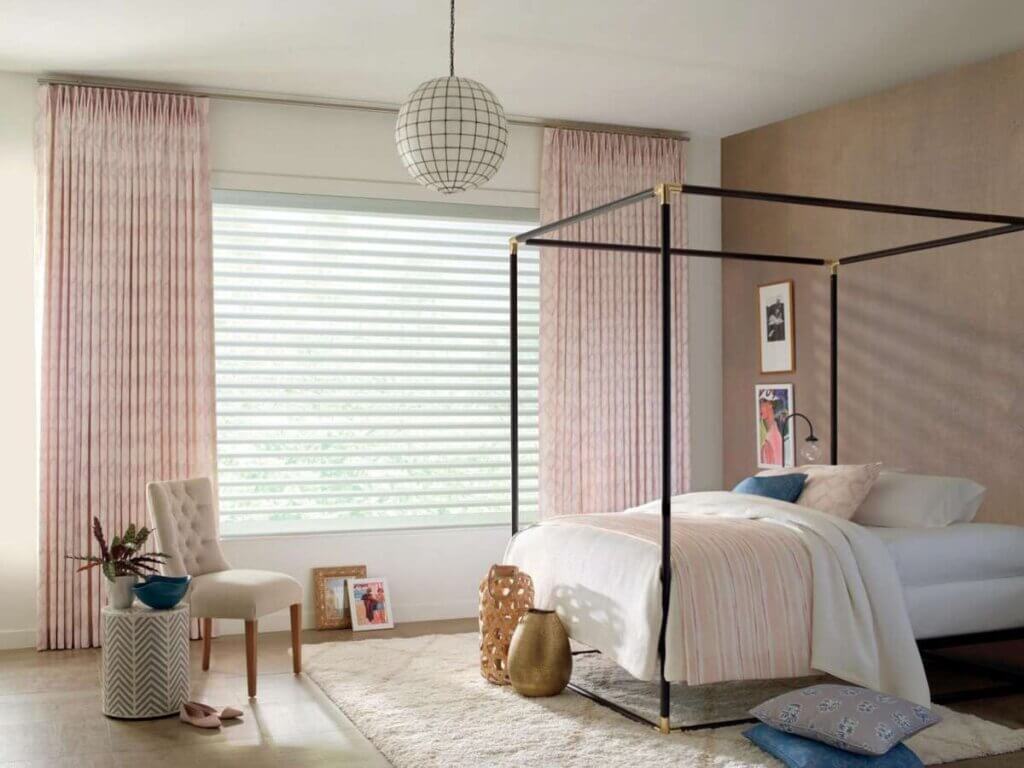
Proper hanging makes printed curtains feel more polished. Mounting the rod higher and wider than the window can make the room feel taller, brighter, and more open.
For most rooms, hang drapery panels several inches above the window frame and extend the rod beyond the window on each side. This allows the fabric to frame the windows rather than block too much natural light. It also gives the panels better spacing, allowing the pattern to fall naturally.
When to Choose Subtle Prints
Subtle printed drapery is a strong choice if you want softness without a dramatic statement. Tone-on-tone patterns, gentle florals, light geometrics, and muted stripes can add design detail while keeping the room peaceful.
Subtle prints are especially useful for bedrooms, offices, nurseries, and rooms with existing artwork or decorative finishes.
From perfect fit to personalized design, explore why custom drapery offers benefits that off-the-shelf options simply can’t match. Read here!
FAQs About Styling Printed Drapery
1. Do printed drapes affect how much light enters the room?
Yes. Lighter colors and sheer fabric let more light through, while darker prints and blackout liners reduce light.
2. Can printed drapery be layered with blinds or shades?
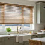
Yes. Choose solid-color blinds or shades so the drapery panels add texture without competing with patterns.
3. Are printed curtains a good choice for open-concept layouts?
They can be. Choose patterns and neutrals that coordinate with nearby rooms to keep the layout visually connected.
4. How often should printed drapery be cleaned?
Most drapery should be dusted regularly and professionally cleaned every 6–12 months, depending on the fabric’s care requirements.
5. Can printed drapery make a room look more expensive?
Yes. Quality fabric, proper hanging, clean spacing, and elegant coordination can give windows a more refined look.
Style Printed Drapery with Confidence
Printed drapery can bring warmth, character, and a finished look to your windows when it is styled with the right balance. Focus on pattern scale, neutral support pieces, thoughtful coordination, and proper hanging to keep the room from feeling overwhelmed. With the right fabric and layout, printed drapes can feel elegant, modern, and easy to live with every day.
MITS Denver South can help you choose printed drapery that fits your space, style, and lighting needs. Schedule a consultation to explore custom options for your home.